I’m glad someone said it….
4 Likes

1 Like
Do your constituents know you have declared them no longer a part of the CLC?
I’m so very salty/butt hurt/ irrationally angry about this. Like, it’s not enough they try to glory steal on the license plates. But to pull it in here and not even get the plane correct?
I’m about ready to single handedly fight this whole Roost.
4 Likes
But to confirm Charlotte is for sure the Queen City and just the First in Flight guys have it wrong, correct?
2 Likes
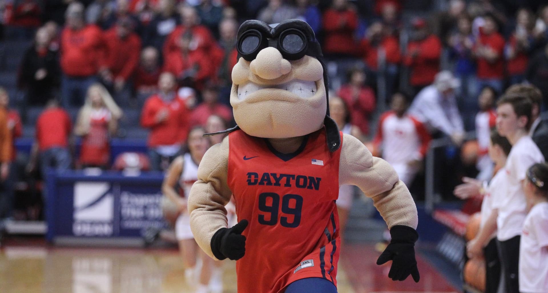
As the captain, our roost is not part of the CLC
Since Charlotte was the Queen City roughly 52 years before Cincinnati, I’d say there isn’t really any debate here.
2 Likes
Listen. I personally think Cincinnati is the better Queen City. But there are like 100 Queen Cities out there.
But this? This is just something else.
2 Likes
Checks out…
23 Likes
I just sang your praises the other day with helping me set up the Ohio Match Play and I truly hate to heel turn on you so quickly. But come on man. 

hot damn, that’s filthy
4 Likes
Hoooo boy. This might be number one. I also might be extremely biased.
5 Likes
Who needs a hat?
7 Likes
@RyanNas I’ll let you know I blew your cover the group tonight and let them know the background of the logo creation tonight. There is a chance you never pay for a round in the state of North Carolina!
For real thank you so much for the help and we absolutely will fund beers and golf.
11 Likes
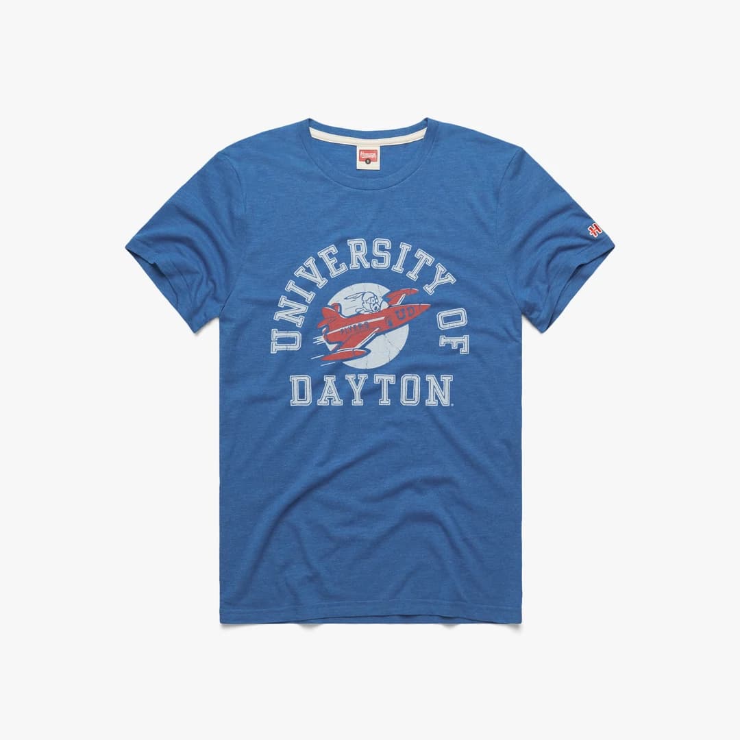
At the risk of being annexed from the Ohio roost, I opted not to do the Wright Flyer, as a historically correct representation of the first plane…probably for the same reason the Dayton Flyers don’t use it. It is too cluttered with shit to work as an actual logo. ![]()
The logo was inspired by their prop models…which are, IMO, the planes that changed aviation forever. It also works way better as a logo. ![]()
With that said, fuck everyone. OATW.
34 Likes
Listen. The logo as an art piece is fantastic. The plane style with the clubs and the color choices are great. It’s not your fault they decided to put “First Flight” over top of it. That’s an issue on the client side IMO.
3 Likes
You are going to fit in GREAT in North Carolina. Golf and beers for life.

12 Likes
You guys are hilarious about that badass logo. It looks great.
It reminds me though. My old country club used to send out emails advertising prime rib but the photo they used was of baby back ribs. It would make us all laugh because it was just another thing the club would botch. One of my buds was so irrationally angry about it that he eventually wrote a strongly worded email about it.
This logo isn’t the same. It’s awesome.
2 Likes
Second City, post your fire-ass logo in here please. You’ve been holding out on us.
4 Likes