Art is great on #1. Any reason for the font choice? And the Serif?
1 Like
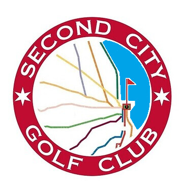
I’d like to see one where the green isn’t green but is negative space.
2 Likes
A Gotham style font may work a little stronger.
1 Like
No green and a flagstick coming off one of the train lines
Right. This is great.
Some of these are more merch designs than core logos.
Everyone is doing great. Whoever actually can lay this out is doing the greatest.
3 Likes
Agree. I used Gotham Ultra for the Beer Hug brand when I created it. It’s a great font family.
2 Likes

3 Likes
6 Likes
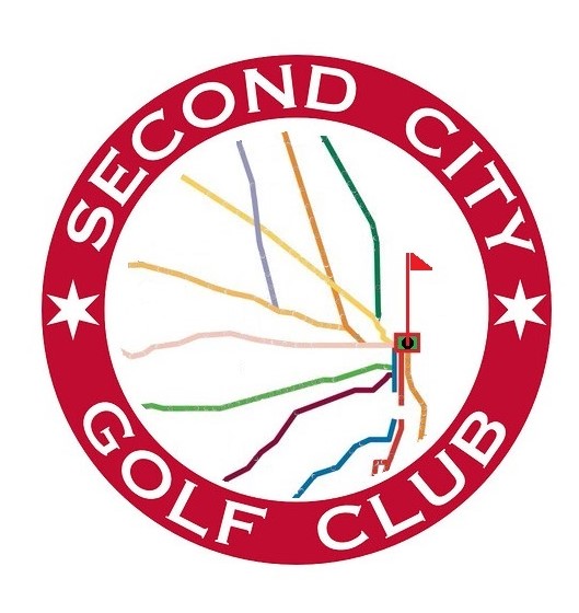
Thought about the lake…
14 Likes
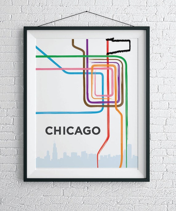
I really like the incorporation of the Metra given how spread out we are, Canal Shores, etc.
2 Likes
Any thoughts to calling it Big Shoulders Golf Club or Windy City…?
Lots of great courses built because of those rail lines.
While I appreciate the metra and all its offerings I still think the loop is a stronger logo. Just my opinion.
Think you could even throw a flag in the center or this and go for sort of the 70’s vibe

6 Likes
I like something like this, a Loop logo that cuts off just outside downtown so you see the tentacles as they leave the loop, but you don’t extend them all the way out. At least for something like a polo or a hat. If you wanted to do a larger logo on a hoodie or t-shirt, you could show the whole system.
1 Like
Something like this, but with the center being a green or Wayward Drive w/ 2CGC inside or something and the top tentacle turning into a pin flag?
12 Likes
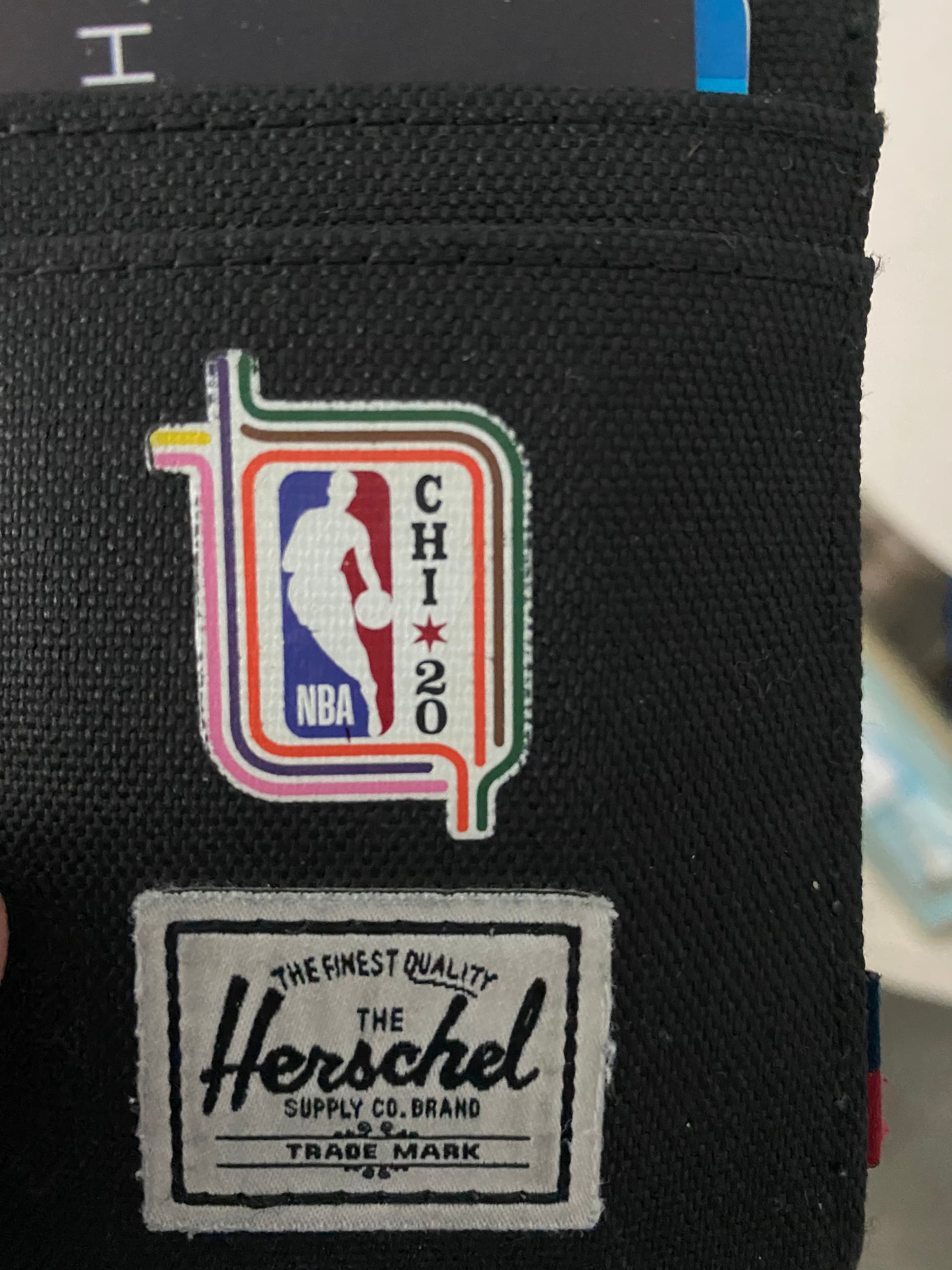
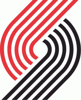
this is the exact template. wayward drive may be “wider” than the nba logo so the 2CGC and the star may be touch to fit in as cleanly as this one.
great find BBK!
2 Likes
Yeah great find BBK!
I am loving the Loop/Metra logos. However, I do think we should consider having a logo that is 1-2 colors rather than 12. I could be mistaken, but I believe a 12 color logo has the potential to really drive up the cost on some of the merch we’d eventually be making. Not saying we shouldn’t use one of these options, just something to consider in all this.
5 Likes
i agree to be mindful of printing. stil think you can do a version of BBK’s that is probably only 3-5 colors, and i think a grayscale version of the correct “final” one could work as well. even an all white or all black version would look cool and have sorta vintage trailblazers and a IYKYK vibes:
I’ve played a bunch of golf with a bunch of refugees and exactly zero of it has been in the city.
And if we took a poll I’m guessing a pretty big number of us live outside the city.
The loop logo as a Chicago icon feels like it’s a badge for people that live or have lived in the city. It’s doesn’t mean squat to me.
To be fair, the Metra lines have a similar effect though, so maybe I just don’t like trains…
4 Likes