@BamaBearcat @MerchCzar that was a great watch. Found a guy we can hire to get you those oil paintings done…

@BamaBearcat @MerchCzar that was a great watch. Found a guy we can hire to get you those oil paintings done…
Which club is this seal and how do I play it so I can have all the logo merch?
That’s The Hay, the short course in Pebble Beach.
Looks like the video is up!

Also, apparently I decided to wear the same polo today that @MerchCzar wore for filming.
Gotta say, Neil pulls it of way better than I do.

Very biased, but I am pretty excited about the 7 Mile Beach logo;
Also because I am glad they upped the logo game for great Tasmanian courses;

Great mention of the spaghetti KH logo, though I thought a mention of the alternative logo was warranted!
Edit: I heard your comments around secondary logos. Fair shout.
Really love the concept and completely missed this thread. One of my favorite discussions…the intersection of golf and design.
The recipe for awful golf logos
Crests - Not really golf’s fault but trying to compete with another sport who has run crests in to the ground, makes it difficult to combine the simplicity necessary to make it work. Everything has been done here and it doesn’t help that one of the truly iconic golf courses has a crest, so it also comes off as try hard for anyone else.
Overlapping letters - It isn’t that overlapping letters don’t work, it is that almost all trample all over the one point of intersection rule of thumb. I had a great graphic design teacher who demonstrated this at one point in my life and it definitely has stood up throughout my career. One point of intersection creates a really nice anchor for the logo and can produce a mark that is very classic and refined. Multiple points of intersection and it can look like a wet hairball.
Cartoonish animals - One of the best ways to torpedo a logo is to create a children’s book version of an animal. Animals can be truly awesome course logos…or they can be the Bandon Dunes’ puffin…where they attempted to make a truly horrid and ugly bird look like it went to a doc in downtown LA. Ugly animals are sweet…this could have been a sweet logo, if it was just an ugly ass bird.
Too many colors - If you can’t create a logo with 2-3 colors, it means it is too complicated to convey.
The recipe for great golf logos
Can be embroidered - Seems simple right? But the number of logos that break this rule is truly astonishing. Logos are most often worn / adorned on a hat or a polo and if you can’t legibly put your logo on either, you maybe need to rethink it.
Distinct form - Shape is something humans are extremely good at recognizing.
Scalability - Can you put it on a sign in front of the clubhouse? Can you also embroider it in a 1 inch x 1 inch square on a polo? Is is recognizable in both instances? If yes, then you are probably getting somewhere.
Memorable - Memorable doesn’t mean it needs to be literal. The lighthouse at Harbortown is literal but I’d argue it isn’t memorable. It doesn’t evoke any sort of emotion it’s more of “Oh look, there’s that thing on the course.” The best brands often evoke some sort of thread…a historical nod, touch or emotion. And that little thread in the logo makes it memorable.
Works with only a single color - If you drop down to black on white or white on black, what happens to your logo? The best logos and brand marks, many times, look better in just a single color…as that is a great litmus test for how well you have executed the simplicity, form and memorability (Word? Probably not).
With all that said, I don’t want to give oxygen to the truly bad ones…hopefully this random guide helps everyone spot them easier. But I will post a few of my personal favorites.
Olympic Club - Works in any and all colors, can be embroidered, is recognizable and evokes kind of being up in the clouds, like many spots on the course. It also looks great with and without text and is a nod to the greek origins of the name.
Maidstone Club - Pretty hard to beat a spouting whale…just elicits that solitude of marine life and something most would agree translates to golf. Really simple, distinct shape and just enough of an understated hint of the sea and spout.

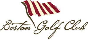
Boston Golf Club - The historical significance of the tattered vertical striped flag, the hint of the American Revolution and a nod to the good kind of patriots.
Ohoopee - Personally think this is a beautiful representation of the region. A nod to the land that surrounds the place and is the perfect climate and soil for growing something that is a key staple in one of my other favorite things: cooking. Would also love to know the significance of the serpents if anyone has a clue.

Myopia Hunt Club - Tough to beat a really simplistic, well done mammal. It also has just a striking font and color set. I think it elicits a lot of emotion…with just the steely reserve of the fox and then the juxtaposition of the horn, which signals the start of the hunt. Chef’s kiss on this one.

@MerchCzar that Stanwich witch logo is stolen valor!
The Salem CC logo in Massachusetts is a great reference to the Salem witch trials:

@westerj12 this may be useful info for you, unless Ryan is already involved
And if he isn’t involved, get him involved.
He’s already involved haha…I’m trusting him to not put my business logo in the category of “bad logos”
This is great stuff and agree on everything you said… until you lead off with Olympic as a good logo. It stinks and and is rip off of Baltusrol which is another stinky logo
Olympic Club logo is awesome and if my 12 seconds of research is to be believed, OC predates Baltusrol by 35 years.
Hey, I feel personally attacked comparing the Baltusrol lobster tails to this versatile piece of graphic art. I’m going down with the ship on anything OC graphic related. ![]()
Correct.
“Since 1890, the famed “Winged O” has been the symbol of the Olympic Club. It was first used in 1890 at the grand opening of the club’s Outside Grounds on Lincoln between 7th and 8th avenues.”
Baltusrol was founded in 1895.
It is pretty extraordinary Olympic Club’s logo holds up like it does. A logo that was created 100+ years ago (by hand) looks pretty timeless to me, even as modern graphic design has pushed things forward. The Olympic Club logo has great balance, form, it is really recognizable and it can stand alone as a single logo mark or be very complimentary when used with text.
Have to be honest, I did 5 seconds of research and saw that the golf courses were built 20+ years after Balty so assumed the logo was later too. Mea Culpa
I still stand by my original point
The Olympic Club was founded in 1860, the winged ‘O’ only exists since 1890. Cursory research doesn’t unearth when actually the Baltusrol logo was created. Kind of good that they did not make it themed on the murder of a farmer. (Not sure how to make a cool logo out of that story).
In case anyone was wondering why a lot of golf courses have the “pink flower” in their logo:


